Design in 2026 is living a contradiction. On one side sits Claude Design — Anthropic’s conversational tool that turns a prompt into an interactive prototype, deck or mockup in minutes. On the other sits the dominant visual mood of the year: the lo-fi, textured, deliberately imperfect aesthetic that exists to prove a human made it.
Key takeaways
- Claude Design turns prompts into interactive prototypes, decks or mockups in minutes.
- Its default aesthetic often uses cream backgrounds, italic serifs, rounded cards and symmetrical layouts.
- Designers use grain, wobble, paper texture and asymmetry as signals of human involvement.
- Importing a design system helps Claude Design keep output on-brand instead of inventing its own style.
- Specific visual direction and multiple options can produce less generic results.
- Finishing generated work by hand can prevent it from reading as machine-made.
Both are winning at the same time. That is worth unpacking, because the designers getting the most out of AI right now are the ones who understand why.
There is now such a thing as “the AI look”
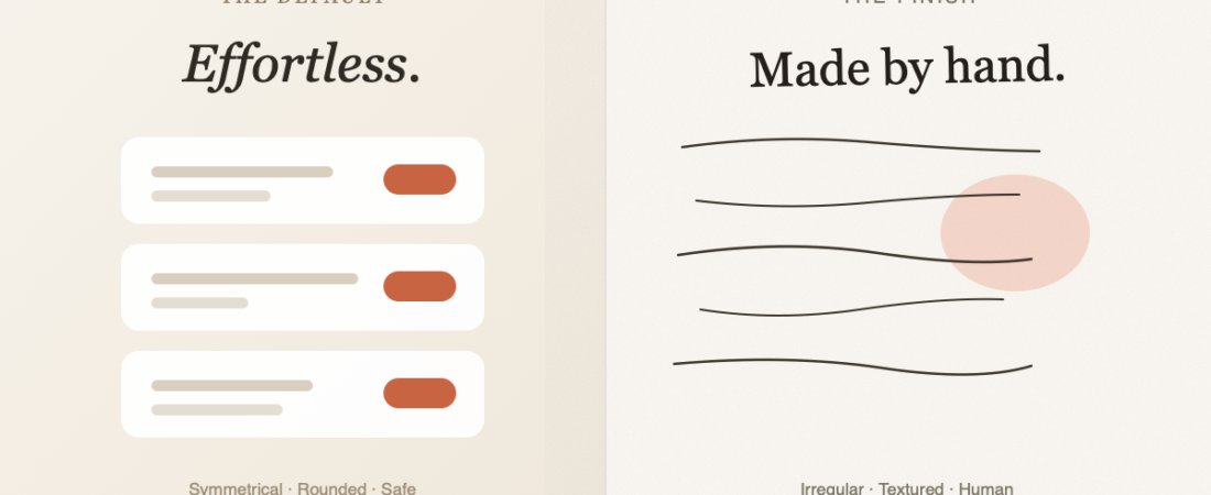
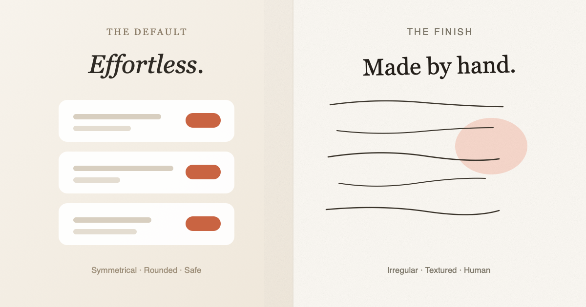
Left to its own devices, Claude Design — like most AI design tools — falls into a recognisable house style. Cream and beige backgrounds. Large italic serifs. Rounded cards in a tidy vertical stack: safe teal or rust accents. Everything centred, everything symmetrical.
It is not ugly. That is the problem. It is competent enough to ship and generic enough that a reader instantly clocks it. Kyle Chayka made the same argument in The New Yorker in June 2026, describing how Anthropic’s tool was creating “overnight web-design clichés” — a look that spread far enough to become its own visual signature.
Once a tool has a default aesthetic, using the default is a decision — just not a very interesting one.
Meanwhile, imperfection became a trust signal
The counter-movement is thriving precisely because of that slickness. Designers are adding grain, hand-drawn wobble, paper texture, visible pencil construction lines and deliberate asymmetry — not because it reads as more beautiful, but because it reads as more human.
The logic is simple and slightly uncomfortable: when perfect output becomes free, perfection stops signalling effort. Roughness becomes the thing that is expensive to fake. Canva‘s 2026 trend work labelled this “Imperfect by Design,” and it is showing up everywhere from packaging to product marketing.
What Claude Design is genuinely good at
Worth being fair about the tool, because the criticism above is about defaults, not capability:
- Speed from idea to something clickable. A shareable interactive prototype or deck in minutes, not an afternoon.
- It can import your design system. From GitHub, from design files, or via
/design-syncin Claude Code — so output can stay on-brand rather than inventing its own look. - It is editable after generation. Canvas editing, contextual sliders, inline comments, and export to PPTX, PDF or HTML.
That second point is the one most people skip, and it is the one that matters most. A tool with no brand context will always fall back to its own.
Four ways designers are beating the default
Nate Parrott, the product designer who built Claude Design, has written about how he actually uses it. His advice, plus what we are seeing from designers in practice:
- Do the thinking before you prompt. The tool is fast at execution and bad at deciding what matters. Arrive with a point of view.
- Name the visual direction explicitly. Fonts, colours, a moodboard, or plain instructions like “add paper grain and slight line irregularity” and “avoid perfect symmetry and rounded cards.”
- Ask for ten options, then remix. The first result is the average of its training data. The tenth is usually where something unexpected shows up.
- Generate, then finish by hand. Use it for velocity, then take the output into Figma — or print it and scan it back — to add the texture and deliberate errors that stop it reading as machine-made.
The mental model that seems to work best: treat it like a very fast junior who needs unusually specific direction. Vague brief, generic output. Same as with people.
The bottom line
Claude Design raises the floor. It makes exploration cheap and gets you to something clickable faster than working from a blank canvas ever will.
The anti-polish trend is the ceiling. Audiences are learning to spot default output, and they reward evidence of human decisions. The designers doing well right now use AI for the speed, then deliberately rough up the result until it stops looking like it came from a tool.
Neither half works alone. Speed without judgement produces the cliché. Judgement without speed just costs you more hours getting to the same place.
Sources
- Kyle Chayka, “The A.I.-Design Aesthetic That’s Taking Over the Internet,” The New Yorker, 24 June 2026
- Nate Parrott, how the product designer who built Claude Design uses it — Anthropic
- Claude Design product page — Anthropic
- Canva Design Trends 2026, “Imperfect by Design”
Illustration produced in-house for this article. Prices and product capabilities described were accurate in August 2026.
Claude Design is for designers who want faster exploration and are willing to supply judgement, brand context and a point of view. Skip it if you want one-click originality: its defaults can produce the same polished clichés designers are now trying to avoid.
Keep reading
Frequently asked questions
What is Claude Design good at?
Claude Design is good at moving quickly from an idea to a clickable prototype or deck. It can also import a design system, support editing after generation, and export to PPTX, PDF or HTML.
Why does AI-generated design look so similar?
AI design tools often fall into recognisable defaults, including cream or beige backgrounds, italic serifs, rounded cards and symmetrical layouts. Without brand context or specific direction, Claude Design can produce work that feels competent but generic.
How can designers make Claude Design output look less like AI?
Designers can name the visual direction explicitly, request details such as paper grain and line irregularity, and ask for multiple options before remixing. They can also finish the result by hand in Figma or by printing and scanning it back.
122 ready-to-use AI prompts — organised by discipline and category, each copyable in one click, free and no sign-up needed. Browse the prompt library →